Your signage is an integral part of your restaurant marketing.
According to the Healthy Professor, we do indeed “eat with our eyes.”
Why is this? It’s because the way food looks is one of the first criteria we use to judge the food we are about to eat.
And, when it comes to restaurants, the other visual aspects matter as well.
That’s why in this article we look at how hungry patrons eat with their eyes and why you need to get your signage right.
Let’s look at how to get your signs just right to promote your restaurant.
Stay True to Your Brand
For a cohesive brand image, your signage should reflect the ambiance of your restaurant, your menu, and the rest of your advertising materials. (tweet this)
Use the same logo, color scheme and feel for your signage as you would your website and your online marketing. This helps create a cohesive, memorable look.
For example, choose colors and fonts and stick with them. When visitors see your color scheme, you want their brains to register your restaurant.
When it comes to signage promoting your brand, think your outdoor and indoor signs, windows, your menu, your table tents, and all of your advertising collateral. It should all match.
Make Your Signage Noticeable
If diners can’t see your signage, they certainly can’t see your restaurant or get a feel for what’s inside.
In this case, bigger is usually the way to go to ensure your patrons can find you.
Consider those passing by on foot, bike, car or bus. Can they all see your signage? Is it large enough? Is it at the right height?
Look at All Angles
Your sign should be large enough to be noticeable from all angles. In other words, you want traffic from all positions to be able to see your sign.
It also pays to consider whether there are some potential impediments to your sign. Are trees in the way? If so, be sure to trim them. Is your sign too short that people in cars can’t see it?
Consider your sign from a number of alternate views so you can hit as many people as possible.
Make Your Sign Visible 24/7
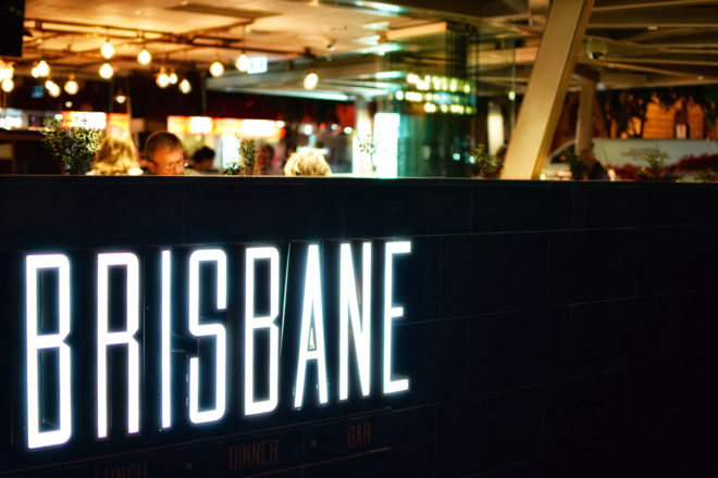
You never know who is driving by, so you want to make sure your sign is also visible from all angles during the night as well as the day. (tweet this)
This means either buying a lighted sign or using lighting to highlight your signage. For example, shining a light on your sign during the nighttime hours.
If you buy a lighted sign, consider LED lights as they are brighter than traditional lights and save energy.

Get creative with your signage, but don’t overdo it. Simple is always better.
Be Creative
If your space doesn’t allow for large signs, it’s time to get creative.
You can use your window space, your awning or your restaurant entrance. You can even set a freestanding sign outside on the sidewalk, just make sure it works with your image.
Consider using your restaurant’s outside architecture to highlight your signage.
Get Animated
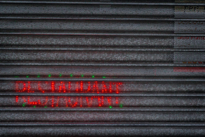
Electronic billboard signs are creeping up all over the world. They are eye-catching and grab your patrons’ attention.
In the right place, an animated sign can work. In addition to highlighting your restaurant and your logo, digital signs allow you to show photos of food and the inside of your restaurant.
As you get animated, you’re truly helping hungry patrons eat with their eyes.
Keep It Simple
When it comes to signage, the simpler, the better.
Passersby have just a few seconds to catch your sign, so you don’t want to complicate it with too much text, dark colors or a drab look.
Make sure your sign is simple, to the point, and very eye-catching. Think about your fonts and your colors and make sure they’re as easy to read close-up as they are at a distance.
Use a Tagline
One way to build your brand and entice hungry patrons is to use a very short tagline.
Consider these short statement examples:
- Family owned
- In business since 1940
- Food made with love
- Traditional Naples Pizza
This signage is best used on windows, inside or on collateral.
Tips for Signage
Next, let’s look at some designer-approved tips for designing your outdoor signage:
- Use light colored fonts on dark backgrounds or dark fonts on light backgrounds. Just make sure there is plenty of contrast for the eye.
- Don’t use script fonts. Use fonts that readers can easily read from far away and close-up.
- Look at your sign closely – make sure there is nothing extraneous that might be distracting to the eye of people driving by.
- Keep to your brand – colors, font and logo.
- Use a contrasting color scheme.
Post a Menu Outside Your Door
If you’ve traveled to tourist destinations, you’ve probably noticed that most restaurants have their menu posted right outside the door.
This is another way to encourage hungry patrons to walk into your restaurant. Consider this an extension of your larger, outdoor signage.
Take a tip from the restaurants in tourist or big cities, and make sure your menu is accessible right outside your door.
Use your menu as an advertising piece to catch hungry patrons with their eyes. Photos and well-thought-out descriptions of your menu items are a best bet.
Promote Specials
You can also post these on the menu outside your door or on a free-standing sign.
Posting your specials is another way to get hungry patrons inside your restaurant.
Make sure that your chosen method is easy to change as you’ll likely change it daily or weekly.
Pay the same attention to this sign as you would your larger signs. Keep to your fonts, logo, color and brand identity.
Final Thoughts
Our senses guide our experiences. Because of this, many people make essential purchasing decisions from the way something looks at first glance.
This is why getting your signage right matters so much. From the signs outside your restaurant to your inside décor and your menu, it all can affect your bottom line.
Your signs are the first way you catch the attention of passersby or those looking for a place to eat.
The signage outside your restaurant conveys to potential diners what they might find in your restaurant.
Entice your customers by providing professional, decorative and functional signage to direct diners inside. Make sure it’s consistent with your brand, and you’ll help your hungry patrons right in the door.
Do you have an online website with an interactive menu that’s attractive to your customers and site visitors? Your website is an extension of your signage and as such needs a responsive, mobile-friendly, interactive website. It’s the ideal way to highlight your restaurant while appealing to your customers.
At Restaurant Engine, we build responsive, mobile-friendly restaurant websites. Contact us today for your free website consultation. We are here to help you update your website and stand out in the crowd so you can stay ahead of your competition.
Images: Jesse Collins and James Sutton
No comments:
Post a Comment